CGPA CALCULATOR & BASIC HTML WEB DEV PROJECT
Introduction:
In this cgpa calculator, user will enter the gp for
each semester,
then click on the submit button to see the cgpa
user can also click the reset button to begin a new
input for calculation
In this mini project we will be using HTML CSS JAVASCRIPT to develop a cgpa calculator
NB: With a querySelector statement, you can select an element based on a CSS selector. This means you can select elements by ID, class, or any other type of selector. Using the getElementById method, you can only select an element by its ID. Generally, you should opt for the selector that most clearly gets the job done.
PHASE 1a: PROTOTYPE (final product)

PHASE 1b: PROTOTYPE (rought sketch)
Let's sketch with our hand how the cgpa calculator will look like

PHASE 2: Html (for structuring the webpage content)
Shortcut for div and class for css: type dot
followed by the name you want e.g .cgpatitle
Shortcut for div and id for css: type hash followed
by the name you want e.g #cgpatitle
CODE IMPLEMENTATION
|
<!DOCTYPE
html> <html
lang="en"> <head> <meta charset="UTF-8"> <meta name="viewport"
content="width=device-width, initial-scale=1.0"> <link rel="stylesheet"
href="fontawesome/css/all.css"> <link rel="stylesheet"
href="style.css"> <title>CGPA
Calculator</title> </head> <body> <!--we have three divisons, top
(title, middle (input box), bottom(buttons))--> <!--create a container to wrap
everything--> <div
class="cgpacontainer"> <!--title section--> <div class="cgpatitle"> <h4>CGPA
CALCULATOR</h4> </div>
<!--input section--> <input type="text"
id="one-gpa" placeholder="1st semester"> <input type="text"
id="two-gpa" placeholder="2nd semester"> <input type="text"
id="three-gpa" placeholder="3rd semester"> <input type="text"
id="four-gpa" placeholder="4th semester"> <input type="text"
id="five-gpa" placeholder="5th semester"> <input type="text"
id="six-gpa" placeholder="6th semester"> <input type="text"
id="seven-gpa" placeholder="7th semester"> <input type="text"
id="eight-gpa" placeholder="8th semester">
<!--output section--> <div
class="cgpa-output"> <h1>Total CGPA =</h1> <button
id="btn-reset">Reset</button> <button
id="btn-submit">Submit</button>
</div>
</div> <script
src="script.js"></script> <script
src=boot/js/jquery.js></script> <script src=boot/js/bootstrap.min.js></script>
</body> </html> |
OUTPUT

PHASE 3 – CSS (for styling the web page content, to make it look attractive and beautiful)
Commenting section for CSS selector to be
implemented
Let’s
map the steps required for the CSS part, then we will select any html part
needed to be styled
NB:
Implement the CSS code of each comment part and reload the browser to see how
the output will look like in each commenting stage
|
/*overall
body of the web page css part*/ /*style
heading tag*/ /*style
body tag*/ /*cgpa
container css part*/ /*cgpa
container > cgpa-title css part*/ /*cgpa
container > input tag css part*/ /*cgpa
container > input tag placeholder css part*/ /*cgpa
container > cgpa-output css part*/ /*cgpa
container > cgpa-output h1 css part*/ /*cgpa
container > cgpa-output > btn-reset css part*/ /*cgpa
container > cgpa-output > btn-submit css part*/ /*cgpa
container > cgpa-output > btn-reset::active css part*/ /*cgpa
container > cgpa-output > btn-submit:active css part*/ |
CODE IMPLEMENTATION
|
/*overall
body of the web page css part*/ *{ margin: 0; padding: 0; box-sizing: border-box; } /*style
heading tag*/ h1,h2,h3,h4,h5,h6{ margin: 0; padding: 0; } /*style
body tag*/ body{ height: 100vh; display: flex; align-items: center; justify-content: center; background: linear-gradient(to top,
#14ca94 0%, #00a8cc 100%); } /*cgpa
container css part*/ .cgpa-container{ width: 500px; height: auto; border-radius: 12px; box-shadow: inset 5px 5px 5px 0px
rgba(255,255,255,0.03), 7px 7px 20px 0px rgba(0,0,0,0.2), 4px
4px 5px 0px rgba(0,0,0,0.1); } /*cgpa
container > cgpa-title css part*/ .cgpa-container
> .cgpa-title{ width: 100%; height: 50px; border-radius: 12px 12px 0px 0px; background-color: #7c0404; text-align: center; line-height: 50px; font-size: 24px; font-family: sans-serif SemiBold; color: #fff; } /*cgpa
container > input tag css part*/ .cgpa-container
> input{ background-color: #fff; outline: none; width: 200px; height: 35px; border-radius: 10px; border: 2px solid #eee; text-align: center; font-weight: bold; color: #242627; margin: 10px; } /*cgpa
container > input tag placeholder css part*/ ::placeholder{ color: #242627; font-size: 16px; } .cgpa-container
.cgpa-output{ width: 100%; margin-left: 20px; } /*cgpa
container > cgpa-output h1 css part*/ .cgpa-container
.cgpa-output h1{ font-family: arial; font-size: 25px; margin-top: 20px; color: #fff; } /*cgpa
container > cgpa-output > btn-reset css part*/ .cgpa-container
.cgpa-output #btn-reset{ margin-right: 20px; border: none; background-color: #770404; outline: none; font-size: 20px; font-family: roboto slab; cursor: pointer; border-radius: 12px; margin: 25px 0px 25px 0px; color: #fff; padding: 5px 20px; box-shadow: inset 5px 5px 5px 0px
rgba(255,255,255,0.03), 7px 7px 20px 0px rgba(0,0,0,0.2), 4px
4px 5px 0px rgba(0,0,0,0.1); margin-right: 15px; } /*cgpa
container > cgpa-output > btn-submit css part*/ .cgpa-container
.cgpa-output #btn-submit{ border: none; background-color: #072af0; outline: none; font-size: 20px; font-family: roboto slab; cursor: pointer; border-radius: 12px; margin: 25px 0px 25px 0px; color: #fff; padding: 5px 20px; box-shadow: inset 5px 5px 5px 0px
rgba(255,255,255,0.03), 7px 7px 20px 0px rgba(0,0,0,0.2), 4px
4px 5px 0px rgba(0,0,0,0.1); } /*when
you click the button*/ /*cgpa
container > cgpa-output > btn-reset::active css part*/ /*cgpa
container > cgpa-output > btn-submit:active css part*/ .cgpa-container
.cgpa-output #btn-reset:active, .cgpa-container
.cgpa-output #btn-submit:active{ box-shadow: inset 5px 5px 5px 0px
rgba(255,255,255,0.03), inset 7px 7px 20px 0px
rgba(0,0,0,0.2), inset 4px 4px 5px 0px
rgba(0,0,0,0.1); } |
PHASE 4 – JAVASCRIPT
Commenting section for Javascript behaviour to be
implemented
Let’s
map the steps required for the javascript part, then we will select any html
part needed to be manipulated
|
//onclick
event function call to get all input value //
do from first to eight value 1(5%),
2(5%), 3(5%), 4(10%), 5(15%), 6(20%), 7(25%), 8(15%) //first
input value get //first
input value [5% per] calculation //first
input final value //onclick
event function call reset all input and output value |
|
Quick
test for the input tag |
|
//onclick
event function call to get all input value document.querySelector('#btn-submit').addEventListener('click',
() =>{ //first
imnput value get let
gp1 = document.querySelector('#one-gpa').value; console.log(gp1); //first
input value [5% per] calculation //first
input final value }) |
|
//another
test as above //first
input value get let
gp1 = document.querySelector('#one-gpa').value; //input
value [5% per] calculation let
gp1_percent = (gp1/100)*5; //input
final value let
gp1_percent_result = gp1_percent.toPrecision(3); console.log(gp1_percent_result); |
|
STEP
to check the value done with javascript -
Load the browser -
Right click and select inspect -
Select the console tab -
Type a value in the first input tab -
Click the submit button -
You will see the output with the help of
console-log(gp1) |
CODE IMPLEMENTATION
|
//onclick
event function call to get all input value document.querySelector('#btn-submit').addEventListener('click',
() =>{ //1(5%),
2(5%), 3(5%), 4(10%), 5(15%), 6(20%), 7(25%), 8(15%) //first
input value get let
gp1 = document.querySelector('#one-gpa').value; //input
value [5% per] calculation let
gp1_percent = (gp1/100)*5; //input
final value let
gp1_percent_result = gp1_percent.toPrecision(3); //second
input value get let
gp2 = document.querySelector('#two-gpa').value; //input
value [5% per] calculation let
gp2_percent = (gp2/100)*5; //input
final value let
gp2_percent_result = gp2_percent.toPrecision(3); //three
input value get let
gp3 = document.querySelector('#three-gpa').value; //input
value [5% per] calculation let
gp3_percent = (gp3/100)*5; //input
final value let
gp3_percent_result = gp3_percent.toPrecision(3); //four
input value get let
gp4 = document.querySelector('#four-gpa').value; //input
value [5% per] calculation let
gp4_percent = (gp4/100)*10; //input
final value let
gp4_percent_result = gp4_percent.toPrecision(3); //five
input value get let
gp5 = document.querySelector('#five-gpa').value; //input
value [5% per] calculation let
gp5_percent = (gp5/100)*15; //input
final value let
gp5_percent_result = gp5_percent.toPrecision(3); //six
input value get let
gp6 = document.querySelector('#six-gpa').value; //input
value [5% per] calculation let
gp6_percent = (gp6/100)*20; //input
final value let
gp6_percent_result = gp6_percent.toPrecision(3); //seven
input value get let
gp7 = document.querySelector('#seven-gpa').value; //input
value [5% per] calculation let
gp7_percent = (gp5/100)*25; //input
final value let
gp7_percent_result = gp7_percent.toPrecision(3); //eight
input value get let
gp8 = document.querySelector('#eight-gpa').value; //input
value [5% per] calculation let
gp8_percent = (gp8/100)*15; //input
final value let
gp8_percent_result = gp8_percent.toPrecision(3); //total
final value sum let
total = parseFloat(gp1_percent_result)+ parseFloat(gp2_percent_result)+ parseFloat(gp3_percent_result)+ parseFloat(gp4_percent_result)+ parseFloat(gp5_percent_result)+ parseFloat(gp6_percent_result)+ parseFloat(gp7_percent_result)+ parseFloat(gp8_percent_result); let total_cgpa = total.toPrecision(3); //total value show output //wip // document.querySelector('h1').innerHTML =
'Total CGPA = ${total_cgpa}' //worked document.querySelector('h1').innerHTML
= 'Total CGPA = ' + total_cgpa; }) //onclick
event function for reset button document.querySelector('#btn-reset').addEventListener('click',
() =>{ //delete the total gpa and resets it to
Total CGPA document.querySelector('h1').innerHTML =
'Total CGPA = ' //do reset for each input tag 1-8 //if you put space in the single quotes,
it will clear the text 1st-8th semester document.querySelector('#one-gpa').value='';
document.querySelector('#two-gpa').value='';
document.querySelector('#three-gpa').value='';
document.querySelector('#four-gpa').value='';
document.querySelector('#five-gpa').value='';
document.querySelector('#six-gpa').value='';
document.querySelector('#seven-gpa').value='';
document.querySelector('#eight-gpa').value=''; }) |
NB:
How to edit multiple lines in VS CODE
Hold Alt on Linux and Windows
Click the places you want to edit
type what you want
When you're done, press Esc to remove all of your
multi-cursors
Motivated by the work of petty programmer
BASICS OF HTML
Generally, html css and javascript are tools used for building the webpages for a website.
HTML is used to create the structure of webpage contents
CSS is used to create styles to beautify webpage contents so that the website can look attractive
Javascript is used to create different behaviours for the webpage contents such as hamburger icon, collapsible tray, display dialogue box for user, etc
In this tutorial we will be learning the basics of html.
Tools required:
download and install VS Code (You can use any other IDE or notepad of your choice)
download and install Chrome browser (You can use any other browser of your choice)
File Structure

HTML Structure
Activities:
create a folder, called to mtn website in any directory of your choice (documents, local disc etc)
NB: If you are using a local server like XAMPP (create the folder inside hotdocs folder), if WAMP (create the folder inside WWW folder)
Steps to write codes in VS Code environment
open VS code,
click file in the menu bar,
click open folder,
locate your website folder,
open it,
to create index.html file
take the cursor to the folder website name, click the first icon that represent file,
name it index.html, click enter key
type exclamation symbol (!) and press the tab key or enter key (this reveals the structure of html required for coding)
to create images folder
option 1: take the cursor to the folder website name, click the second icon that represent folder,
name it images, click enter key. then drop all the images to be used for the webpages in the images folder
option 2: open the folder website name, right click the mouse, point to new, click folder, name it images, click enter key. then drop all the images to be used for the webpages in the images folder
LAB-WEEK 1: HTML elements to create webpage contents
We will use the following html elements:
img tag (image)
a tag (anchor)
ol, ul tags (ordered list, unordered list)
hr tag (horizontal)
h1-h6 tag (heading)
p tag (paragraph)

|
<!DOCTYPE html> <html lang="en"> <head> <meta
charset="UTF-8"> <meta
http-equiv="X-UA-Compatible" content="IE=edge"> <meta
name="viewport" content="width=device-width,
initial-scale=1.0"> <title>MTN
Website</title> </head> <body> <!--company
logo--> <img
src="images/location.png" width =100 alt="WHITEPACE
ACADEMY"> <!--navigation
menu--> <ul> <li><a
href="#">Data</a></li> <li><a
href="#">Devices</a></li> <li><a
href="#">SIM Services</a></li> </ul> <!--body--> <h1>MTN
Pulse</h1> <hr> <h2>Frequently Asked
Questions</h2> <hr> <h3>What is MTN
Pulse</h3> <p> MTN Pulse is a prepaid
tariff plan that allows you to enjoy a FLAT rate of 12k/sec for calls ACROSS
ALL local Networks in Nigeria after the first 90
seconds call of the day at 27k/sec. With MTN Pulse, “You Talk more, Laugh
more and Love more”. To join MTN Pulse, text 406 to 312, dial
*406*1# or *123*2*2#. </p> <h2>Why should i
migrate to MTN pulse</h2> <!--we need to nest ol
and ul--> <ol type
="A"> <li>You will
enjoy the following benefits when you are on MTN Pulse:</li> <ul> <li> Flat
rate of 12k/sec for calls ACROSS ALL local Networks after spending 27k/sec on
the first 90 seconds call of the day. </li> <li>Text 406 to 312</li> <li>Dial
*406*1# or *123*2*2#.</li> </ul> <li>Migration
into Pulse is free. However, if it is your subsequent migration within 30
days then you will be charged ₦102.</li> </ol> <!--unordered list
sample--> <ul> <li> Flat rate of
12k/sec for calls ACROSS ALL local Networks after spending 27k/sec on the
first 90 seconds call of the day. </li> <li>Text 406 to
312</li> <li>Dial *406*1#
or *123*2*2#.</li> </ul> </body> </html> |


CODE IMPLEMENTATION
|
<!DOCTYPE html> <html lang="en"> <head> <meta
charset="UTF-8"> <meta
name="viewport" content="width=device-width,
initial-scale=1.0">
<title>Document</title> <style> table, th, td{ padding: 1rem; text-align: left; background-color:
rgb(168, 157, 157); border: 1px solid
black; border-collapse:
collapse; } </style> </head> <body> <h1>List of some MTN
USSD Codes and their uses</h1> <hr> <table> <thead> <tr>
<th>ID</th> <th>USSD
CODE</th> <th>USE
OF CODE</th> </tr> </thead> <tbody> <tr>
<td>1</td>
<td>*310#</td> <td>Check
Airtime</td> </tr> <tr>
<td>2</td>
<td>*904*Amount#</td> <td>Buy
Airtime from your Bank</td> </tr> <tr>
<td>3</td>
<td>*777*recipient phone number*amount*PIN#</td> <td>Share
Airtime from MTN to MTN</td> </tr> </tbody> </table> </body> </html> |
Shortcuts to create html elements instead of typing each one by one
To create two or more
sections
Type: section*2
Press tab key
NB: You can apply the above in th, tr etc
To create two or more
sections with class css selector
Type: section.*2
Press tab key
To create link for
style.css
Type: link:css
Press tab key
To create width of 25px (do same for height)
Type: w25
Press tab key
How To Add a Border
To add a border, use the CSS border property on table, th,
and td elements:
To avoid having double borders like in the example above,
set the CSS border-collapse property to collapse. This will make the borders
collapse into a single border:
table, th, td {
border: 1px solid
black;
border-collapse:
collapse;
}

|
<!DOCTYPE html> <html lang="en"> <head> <meta
charset="UTF-8"> <meta
name="viewport" content="width=device-width,
initial-scale=1.0"> <title>MTN
Website</title> <style> *{ margin: 0; padding: 0; box-sizing: border-box; font-family:
sans-serif; } body{ min-height: 100vh; display: flex; justify-content:
center; align-items:
center; /*background-image:
url(images/bkg1.jpg);*/ background:
url(images/bkg1.jpg) center / cover; } /*style the image
between the table data*/ td img{ width: 25px; height: 25px; margin-right: 0.5rem; /*create space between image and text*/ border-radius: 50%; vertical-align:
middle; /*makes the image and text to be aligned (on the same line)*/ } /* table{ width: 100%; } */ /*to style and add
space between the table, th and td tags*/ table, th, td{ padding: 1rem; text-align: left; border-collapse:
collapse; /*to remove the default border shape created by the browser*/ } thead th{ position: sticky; top: 0; left: 0; background-color:
#645785fe; } /*different color for
data in even position*/ tbody
tr:nth-child(even){ background-color:
#0000000b; } /*when you over the
mouse, it will show white*/ tbody tr:hover{ background-color:
#fff6; } /*style main with class
name tableinfo*/ main.tableinfo{ width: 82vw; /*it repositions the entire heading and
table content*/ height: 90vh; background-color:
#fff5; /*5 represent transparent value*/ backdrop-filter:
blur(7px); /*to make the image blur*/ box-shadow: 0 .4rem
.8rem #0005; /*x offset, y offset, spread value, border radius*/ border-radius:
.8rem; /*for the edges of the table*/ overflow: hidden; } .table-header{ width: 100%; height: 10%;
/*shifts the tbody from the h2*/ background-color:
#fff4; padding: .8rem 1rem
/*top&bottom, left&right*/ } .table-body{ width: 95%; max-height: 89%; background-color:
#fffb; margin: .8rem auto;
/*to adjust the table in the main box*/ border-radius:
.6rem; overflow: auto;
/*if content exceed the main size, it will show scroll bar*/ } /*to manage the scroll
bar*/
.table-body::-webkit-scrollbar{ width: 0.5rem; height: 0.5rem; }
.table-body::-webkit-scrollbar-thumb{ border-radius:
0.5rem; background-color:
#0004; visibility: hidden;
/*hid the scrollbar*/ }
.table-body:hover::-webkit-scrollbar-thumb{ visibility:
visible; /*scrollbar shows upon hovering*/ } /*different color
indicator for different status*/ .status{ background-color:
red; padding: .3rem
0.3rem; /*y pos, x pos*/ border-radius:
2rem; text-align: center; } .status.active{ background-color:
#86e49d; color: #006b21; } .status.inactive{ background-color:
#d893a3; color: #b30021; } .status.pending{ background-color:
#6fcaea; } /*responsive */ /*when screen has
maximum width of 1000*/
@media(max-width:1000px){
td:not(:first-of-type){
/*handles the table data*/ min-width:
12.1rem; } } </style> </head> <body> <main
class="tableinfo"> <section
class="table-header"> <h1>Player's
Information</h1> </section> <section
class="table-body"> <table> <thead> <tr> <th>ID</th>
<th>club</th>
<th>player</th>
<th>Status</th> </tr> </thead> <tbody> <tr>
<td>1</td> <td><img
src="images/location.png" width="25"
alt="mancity"><strong>Manchester
City</strong></td>
<td>Erling Haaland</td> <td> <p
class="status active">Active</p> </td> </tr> <tr>
<td>2</td>
<td><img src="images/location.png"
width="25"
alt="psg"><strong>PSG</strong></td>
<td>Mbappe</td> <td> <p class="status
pending">Pending</p> </td> </tr> <tr>
<td>3</td>
<td><img src="images/location.png"
width="25" alt="bayern"><strong>Bayern
Munich</strong></td>
<td>Leroy Sane</td> <td> <p
class="status inactive">Inactive</p> </td> </tr> </tbody> </table> </section> </main> </body> </html> |
Objective:
We will use the type attribute to accept text, password and
submit from the user
Other attributes used within the input tag are name, id, email,
placeholder, required (The required attribute is a boolean attribute. When
present, it specifies that an input field must be filled out before submitting
the form.)
CODE OUPTUT
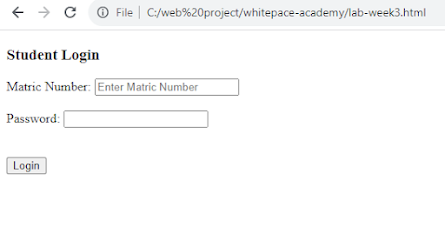
CODE IMPLEMENTATION
|
<!DOCTYPE html> <html lang="en"> <head> <meta
charset="UTF-8"> <meta
name="viewport" content="width=device-width,
initial-scale=1.0"> <title>Student
Login</title> </head> <body> <h3>Student
Login</h3> <label
for="">Matric Number:</label> <input
type="text" name="" id=""
placeholder="Enter Matric Number" required> <br> <br> <label
for="">Password:</label> <input
type="password"> <br> <br> <!-- it will hand the
data submission when user clicks the button --> <br> <input
type="submit" value="Login"> <!-- we can use button
element <button
type="submit">Login</button> --> </body> </html> |
Shortcuts
To create comment
Type the comment
Highlight the comment
Press ctrl + /
NB:
-
The type
attribute specifies the input element to be displayed to the user
- The for (attribute in label) and the id (attribute in input) should have the same name

CODE OUTPUT - HTML CSS

|
<!DOCTYPE html> <html lang="en"> <head> <meta
charset="UTF-8"> <meta
name="viewport" content="width=device-width,
initial-scale=1.0"> <title>Sign In
Page</title> <style> *{ font-family:
sans-serif; margin: 0; padding: 0; box-sizing:
border-box; } body{ display: flex; justify-content:
center; align-items:
center; min-height: 100vh; /* background: gray;
*/ } /* helps to position
the div boxsignin */ .boxsignin{ position: relative; width: 400px; height: 400px; display: flex; justify-content:
center; align-items:
center; background:
rgba(8, 8, 8); } .boxsignin form{ position:
relative; width: 100%; display: flex; justify-content:
center; align-items: center; flex-direction:
column; /* it does the job of
<br> element */ gap: 20px; padding: 0 40px; } .boxsignin form h2{ color: white; font-weight: 600; } .boxsignin form input{ position: relative; width: 85%; background:
rgba(255, 255, 255, 0.1); padding: 10px
15px; /* this increases the size of
the box */ border: none; outline: none; border-radius: 8px; color: #fff; font-size: 1em; letter-spacing:
0.05em; } .boxsignin form
input::placeholder{ /* background:
rgba(255, 255, 255, 0.4); */ color: #fff; } .boxsignin form
input[type="submit"]{ font-weight: 600; background: white; color: black; cursor: pointer; transition: 0.5s; } .boxsignin form
input[type="submit"]:hover{ background: green; } .boxsignin form .group{ width: 85%; display: flex; justify-content:
space-between; } .boxsignin form .group
a{ color: white; text-decoration:
none; } .boxsignin form .group
a:last-child{ color: #5ebdc4; } </style> </head> <body> <!-- the box for the
sign up form --> <div
class="boxsignin"> <form
action=""> <h2>Student
Login</h2> <input
type="text" placeholder="Username"> <input
type="password" placeholder="Password"> <input
type="submit" value="Login"> <div
class="group"> <a
href="#">Forget Password</a> <a
href="#">Sign Up</a> </div> </form> </div> </body> </html> |

|
<!DOCTYPE html> <html lang="en"> <head> <meta
charset="UTF-8"> <meta
name="viewport" content="width=device-width,
initial-scale=1.0">
<title>Document</title> </head> <body> <form
action="`"> <label
for="">Course Name:</label> <input
type="text" required size="35"> <br> <br> <label
for="">Course Code:</label> <input
type="text" required size="35"> <br> <br> <label
for="">Email:</label> <input
type="email" size="35"> <br> <br> <h3>Student
level</h3> <label
for="">Choose a level:</label> <select
name="sem" id=""> <option
value="">--please select a level--</option> <option
value="">ND1</option> <option
value="">ND2</option> <option
value="">HND1</option> <option
value="">HND2</option> </select> <h3>Subjects
verified</h3> <input
type="checkbox" name="sub1" id=""
value=""> <label
for=""> Mathematics</label> <input
type="checkbox" name="sub2" id=""
value=""> <label
for=""> English</label> <input
type="checkbox" name="sub3" id=""
value=""> <label
for=""> Physics</label> <input
type="checkbox" name="sub4" id=""
value=""> <label
for=""> Yoruba</label> <input
type="checkbox" name="sub5" id=""
value=""> <label
for=""> Chemistry</label> <h3>How was your time
this semester?</h3> <input
type="radio" name="exp" id=""
value=""> <label
for=""> Bad</label> <input
type="radio" name="exp" id=""
value=""> <label
for=""> Okay</label> <input
type="radio" name="exp" id=""
value="" checked> <label
for=""> Good</label> <br> <label for="start">DOB:</label> <input type="date" id="start" name="trip-start" value="" min="1980-01-01" max="2023-12-31" /> <br> <br> <input
type="submit" value="Save"> </form> </body> </html> |
NB:
we use the form element to group all the required elements required to be submitted to the database when the save button is clicked. although, database is not within this scope

|
<!DOCTYPE html> <html
lang="en"> <head> <meta charset="UTF-8"> <meta name="viewport"
content="width=device-width, initial-scale=1.0"> <title>Document</title> </head> <body> <form action=""> <h2>Student Details</h2> <label
for="">Weight:</label> <!-- value puts the knob at
the centre of the range slider --> <input type="range"
min="0" max="100" value="50"
id="slider">
<br> <br>
<label for="">Full
name:</label> <input type="text"
name="" id="" placeholder="Enter full name"> <br> <br>
<label
for="">Phone:</label> <input type="number"
name="" id="" placeholder="Enter phone"> <br> <br>
<label
for="start">DOB:</label> <input type="date"
id="start" name="trip-start" value=""
min="1980-01-01" max="2023-12-31" /> <br> <br>
<label for="">Load
Picture</label> <input type="file">
<br> <input type="submit"
value="Save"> </form> </body> </html> |
LAB-WEEK: Non Responsive Navigation Bar
We will be using only HTML CSS to achieve the objective above
CODE OUPTUT

CODE IMPLEMENTATION
Creating navigation
bar
|
<!DOCTYPE
html> <html
lang="en"> <head> <meta charset="UTF-8"> <meta name="viewport"
content="width=device-width, initial-scale=1.0"> <meta
http-equiv="X-UA-Compatible" content="ie=edge"> <title>WHITEPACE
ACADEMY</title> <link rel="stylesheet"
href="style.css"> <style> *{ box-sizing: border-box; } body{ margin: 0; padding: 0; } .navbar{ display: flex; justify-content: space-between; align-items: center; background-color: green; color: whitesmoke; } .brand-title{ font-size: 1.5rem; margin: 0.5rem; /*to push it to the right*/ } .navbar-links ul{ margin: 0; padding: 0; display: flex; } .navbar-links li{ list-style: none; } .navbar-links li a{ text-decoration: none; color: white; padding: 1rem; display: block; } .navbar-links li:hover{ background-color: blueviolet; } </style> </head> <body> <nav class="navbar"> <div class="brand-title">Whitepace
Academy</div> <div
class="navbar-links"> <ul> <li><a
href="#">Home</a></li> <li><a
href="#">Service</a></li> <li><a
href="#">About Us</a></li> </ul> </div> </nav> <script
src="index.js"></script> </body> </html> |

|
<!DOCTYPE
html> <html
lang="en"> <head> <meta charset="UTF-8"> <meta name="viewport"
content="width=device-width, initial-scale=1.0"> <meta
http-equiv="X-UA-Compatible" content="ie=edge"> <title>WHITEPACE ACADEMY</title> <link rel="stylesheet"
href="style.css">
<style> *{ box-sizing: border-box; } body{ margin: 0; padding: 0; } .navbar{ display: flex; justify-content: space-between; align-items: center; background-color: green; color: whitesmoke; } .brand-title{ font-size: 1.5rem; margin: 0.5rem; /*to push it to the right*/ } .navbar-links ul{ margin: 0; padding: 0; display: flex; } .navbar-links li{ list-style: none; } .navbar-links li a{ text-decoration: none; color: white; padding: 1rem; display: block; } .navbar-links li:hover{ background-color: blueviolet; }
/* toggle button begins*/ .toggle-button{ position: absolute; top: .75rem; right: 1rem; display: none; /*to show the hamburger for time being on
small screen*/ flex-direction: column; justify-content: space-between; width: 30px; height: 21px; } .toggle-button .bar{ height: 3px; width: 100%; background-color: white; border-radius: 10px; } @media(max-width:
450px){ .toggle-button{ display: flex; } .navbar-links{ display: none; width: 100%; /*fill up the color from L-R*/ } .navbar{ flex-direction: column; align-items: flex-start; } .navbar-links ul{ flex-direction: column; } .navbar-links li{ text-align: center; } .navbar-links li a{ padding: .5rem 1rem; } .navbar-links.active{ display: flex; } }
</style> </head> <body> <nav class="navbar"> <div
class="brand-title">Whitepace Academy</div> <!-- hamburger icon --> <a href="#"
class="toggle-button">
<span class="bar"></span> <span
class="bar"></span> <span
class="bar"></span> </a>
<div
class="navbar-links"> <ul> <li><a
href="#">Home</a></li> <li><a
href="#">Service</a></li> <li><a
href="#">About Us</a></li> </ul> </div> </nav> <script type="text/javascript"> const hamburger = document.querySelector(".toggle-button"); const navmenu = document.querySelector(".navbar-links"); hamburger.addEventListener("click", () => { hamburger.classList.toggle("active"); navmenu.classList.toggle("active"); }) </body> </html> |
script.js (W.I.P)
<!-- <script type="text/javascript">
alert("click OK to see the main page"); const togglebtn = document.getElementsByClassName('toggle-button')[0] const navbarlink = document.getElementsByClassName('navbar-links')[0] togglebtn.addEventListener('click',() =>{ navbarlink.classList.toggle('active') }) </script> --> |
NB: Press F12 to view developer tool

|
<!DOCTYPE
html> <html
lang="en"> <head> <meta charset="UTF-8"> <meta name="viewport"
content="width=device-width, initial-scale=1.0"> <meta http-equiv="X-UA-Compatible"
content="ie=edge"> <title>WHITEPACE
ACADEMY</title> <link rel="stylesheet"
href="style.css">
<style> *{ padding: 0; margin: 0; box-sizing: border-box; }
header{ background-color: #262626; } li{ list-style: none; } a{ color: white; text-decoration: none; } .navbar{ min-height: 70px; display: flex; justify-content: space-between; align-items: center; padding: 0 24px; } .nav-menu{ display: flex; justify-content: space-between; align-items: center; gap: 60px; } .nav-branding{ font-size: 2rem; } .nav-link{ transition: 0.7s ease; } .nav-link:hover{ color: dodgerblue; } .hamburger{ display: none; cursor: pointer; } .bar{ display: block; width: 25px; height: 3px; margin: 5px auto; -webkit-transition: all 0.3s ease-in-out; transition: all 0.3s ease-in-out; background-color: white; }
@media(max-width:
768px){ .hamburger{ display: block; } .hamburger.active .bar:nth-child(2){ opacity: 0; } .hamburger.active .bar:nth-child(1){ transform: translateY(8px) rotate(45deg); } .hamburger.active .bar:nth-child(3){ transform: translateY(-8px)
rotate(-45deg); } .nav-menu{ position: fixed; left: -100%; top: 70px; gap: 0; flex-direction: column; background-color: #262626; width: 100%; text-align: center; transition: 0.3s; } nav-item{ margin: 16px 0; } .nav-menu.active{ left: 0; } } </style>
</head> <body> <header> <nav class="navbar"> <a href="#"
class="nav-branding">Whitepace Academy</a>
<ul class="nav-menu"> <li class="nav-item"> <a href="#"
class="nav-link">Home</a> </li> <li class="nav-item"> <a href="#"
class="nav-link">Service</a> </li> <li class="nav-item"> <a href="#"
class="nav-link">About Us</a> </li> </ul>
<div class="hamburger"> <span
class="bar"></span> <span
class="bar"></span> <span
class="bar"></span> </div> </nav> </header>
<script
src="script.js">
</script>
</body> </html> |
script.js
|
const hamburger =
document.querySelector(".hamburger"); const navmenu =
document.querySelector(".nav-menu");
hamburger.addEventListener("click",
() => { hamburger.classList.toggle("active"); navmenu.classList.toggle("active"); })
document.querySelectorAll(".nav-link").forEach(n
=> n.addEventListener("click", () =>{ hamburger.classList.remove("active"); navmenu.classList.remove("active"); })) |

|
<!DOCTYPE
html> <html
lang="en"> <head> <meta charset="UTF-8"> <meta name="viewport"
content="width=device-width, initial-scale=1.0"> <meta
http-equiv="X-UA-Compatible" content="ie=edge">
<!-- fontawesome cdn link --> <link rel="stylesheet"
href="https://cdnjs.cloudflare.com/ajax/libs/font-awesome/6.4.2/css/all.min.css"
integrity="sha512-z3gLpd7yknf1YoNbCzqRKc4qyor8gaKU1qmn+CShxbuBusANI9QpRohGBreCFkKxLhei6S9CQXFEbbKuqLg0DA=="
crossorigin="anonymous" referrerpolicy="no-referrer"
/>
<title>WHITEPACE
ACADEMY</title> <link rel="stylesheet"
href="style.css">
<style> *{ padding: 0; margin: 0; box-sizing: border-box; font-family: 'Poppins', sans-serif; scroll-behavior: smooth; } nav{ position: fixed; left: 0; top: 0; height: 75px; width: 100%; background: green; box-shadow: 0 5px 10px rgba(0,0,0,0.15); } nav .navbar{ display: flex; align-items: center; justify-content: space-between; height: 100%; width: 90%; background: green; margin: auto; } nav .navbar .logo a{ color: #fff; font-size: 27px; font-weight: 600; text-decoration: none; } nav .navbar .menu{ display: flex; } .navbar .menu li{ list-style: none; margin: 0 15px; } .navbar .menu li a{ color: #fff; font-size: 17px; font-weight: 500; text-decoration: none; } section{ height: 100vh; width: 100%; display: flex; align-items: center; justify-content: center; color: #96c7e8; font-size: 70px; } #home{ background: #fff; } #service{ background: #f2f2f2; } #about{ background: #262626; } section .login{ font-size: 14px; color: black; } .button a{ position: fixed; bottom: 20px; right: 20px; color: #fff; padding: 7px 12px; border-radius: 6px; font-size: 18px; background: green; box-shadow: rgba(0, 0, 0, 0.15); }
</style>
</head> <body> <nav> <div class="navbar"> <div class="logo"> <a
href="#">Whitepace Academy</a> </div> <ul class="menu"> <li> <a
href="#home">Home</a> </li> <li> <a
href="#service">Service</a> </li> <li> <a
href="#about">About</a> </li> </ul> </div> </nav>
<section id="home"> <h2>Login Section</h2> <div class="login"> <label>Username:</label> <input type="text"
name=""> <br> <label>Password:</label> <input type="password"
name="">
</div>
</section> <section
id="service">Service section</section> <section id="about">About
section</section>
<div class="button"> <a href="#"><i
class="fas fa-arrow-up"></i></a> </div>
<script
type="text/javascript"> </script>
</body> </html> |
Nunca pensé que calcular notas sería tan simple hasta que di con https://calculadoradenotas.cl/, una herramienta que se ha vuelto imprescindible en mis estudios.
ReplyDelete